What we did
We began by defining the business objectives. While there were several, they can be summed up as:
- Acquire more customers through the website
- Reduce maintenance costs
We looked at the way users were interacting with the site using tools like HotJar and Google Analytics. We spoke to the customer support staff and obtained a log of the most common questions and frustrations from users. This helped us gain insight into the pain points people were experiencing.
We reviewed the underlying database and how it was structured. The most important thing for a delivery based system is the house address. It was clear that the address data underlying the system would have to be replaced.
We set about designing a new set of UX flows that would maximise the onboarding efficiency of the site. We created wireframes and tested them on Usertesting.com and in internal focus groups.
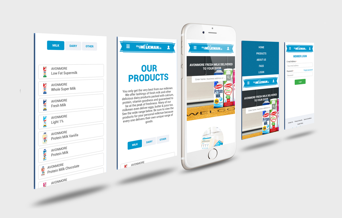
We recommended that the client replace their sites and mobile applications with a progressive web app, instead.
We also recommended that instead of creating any cognitive load for potential customers that we should have a single field, like a google search and that we would do all the thinking from then on.
That single field would be an address search. We would take the user’s input and call the Google Geolocation APIs to find a match for the address. We extended that capability by obtaining a database of all addresses in the country and facilitated fast full-text searching so that we could match by eircode or other search parameters.
We worked with the client to create coverage maps for each delivery agent, so that when we had the latitude and longitude of an address, we would know if it sat within a zone with an associated milkman / woman.
We would then show the customer a photo of the milk agent and invite them to start choosing products from the range specific to that agent.
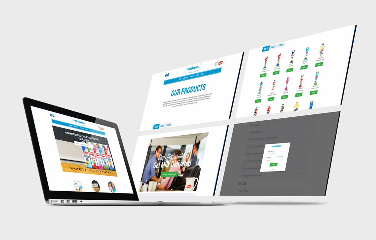
We completed the rework and launched the single responsive site, and continue to monitor and tweak the flows as we see any opportunity to improve them.


