What we did
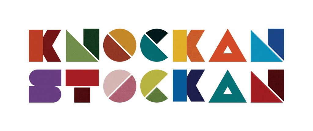
In order to achieve a sense of inclusivity and openness, we worked with the team in KnockanStockan on their brand identity, logo design, campaign idea, print and social content for KnockanStockan 2019.
The first step was to look at the brand identity of KnockanStockan. To create a tone of voice and a visual style that represents and communicates KnockanStockan’s credentials as a festival. The aim was to make it bright, positive and inclusive but also well crafted and curated. The colour palette was derived from their previous logo and represent the colours of the land, while the geometric shapes reflect the music, the water and the geography of the festival site. The logo itself is simple, but playful and welcoming. It has a grainy and earthy texture to it that once again reminds the audience of the craft that goes into this festival.
This was reinforced by the core campaign idea and ethos of the festival, which is to support and “Love New Music”. The aim with this campaign idea is to invite people from all over Ireland to join in on this unique experience, to explore, to experience and to love new music.
The second step was to bring all of this work to life with the first line up announcement. How did we do this?
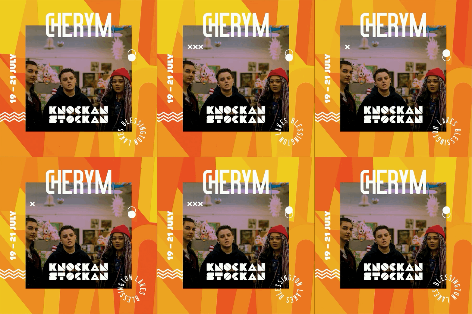
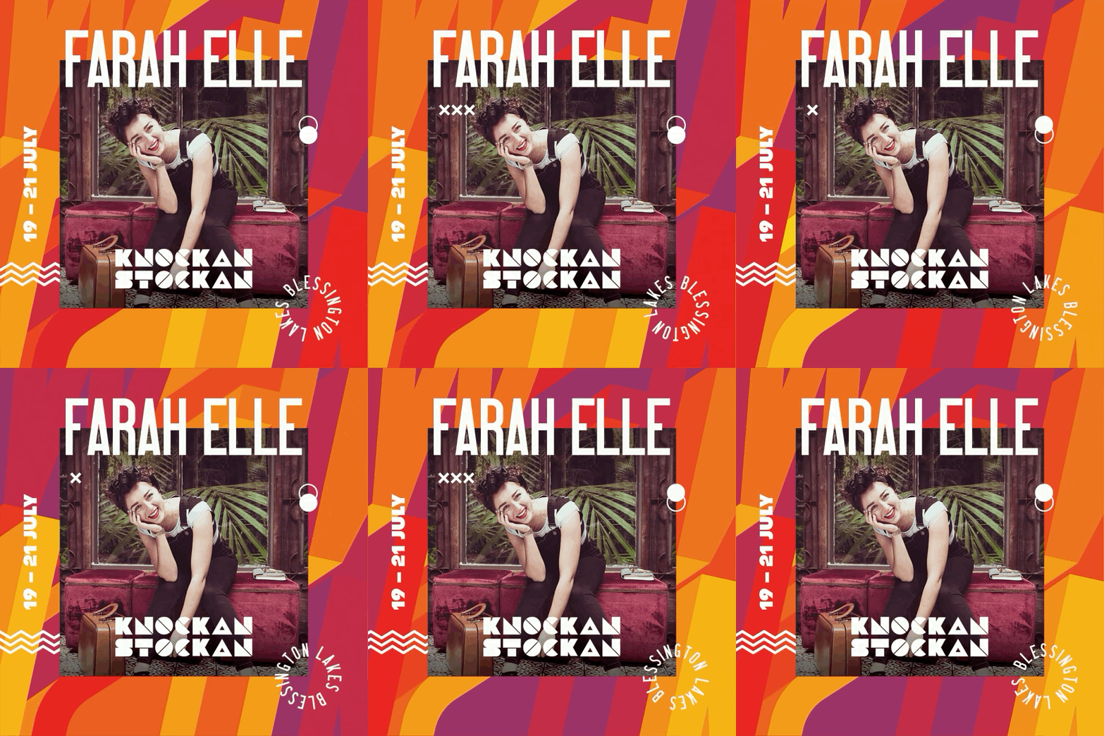
A teaser post was shared on KnockanStockan’s social channels to build up a bit of momentum and to give a taste of the new look & feel.
This was followed by the full line up announcement, which included a 50-second animated video showcasing the first wave of acts confirmed for the festival. The bands were also encouraged to post on their own social channels and were supplied with KnockanStockan branded GIFs for Twitter, Facebook & Instagram. This created a huge amount of noise on social. This was also brought to life through print, with the first poster for KnockanStockan 2019.


