The Response
We researched the site users and created a number of user personas. For each persona we established their motivations and developed insights into the reasons why they visited the site and what actions they wanted to complete.
For donors it was critical that we provided them with the reassurance that their money was going to go to the services that were needed most. Re-assurance is provided by putting the stories of those people who receive assistance to the fore along with those who provide that assistance. The video stories also helped to create an emotive connection.
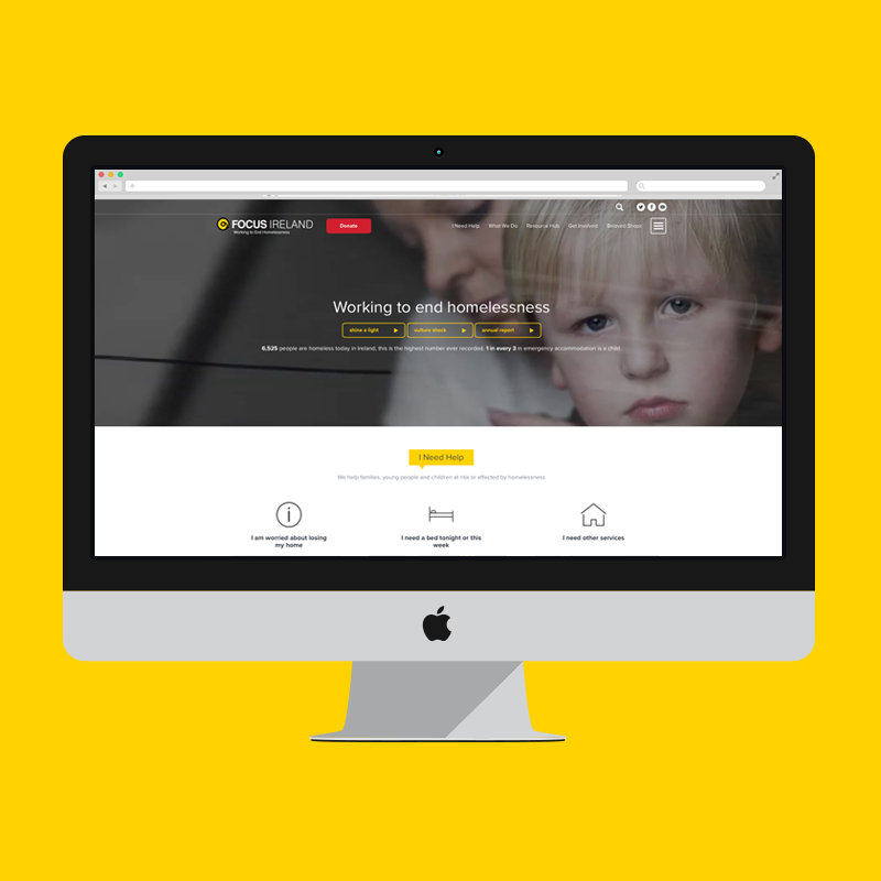
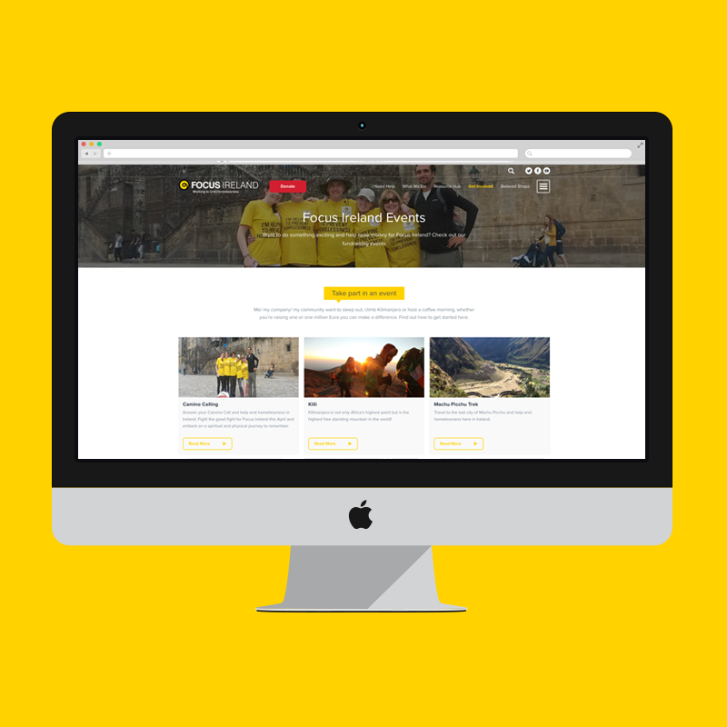
We simplified the navigation and information architecture to ensure that those looking for services found them easily. We created a services map that allows people to see exactly what help is close by and who they should contact.
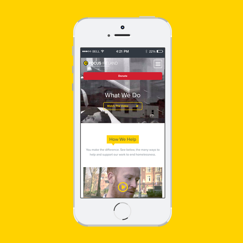
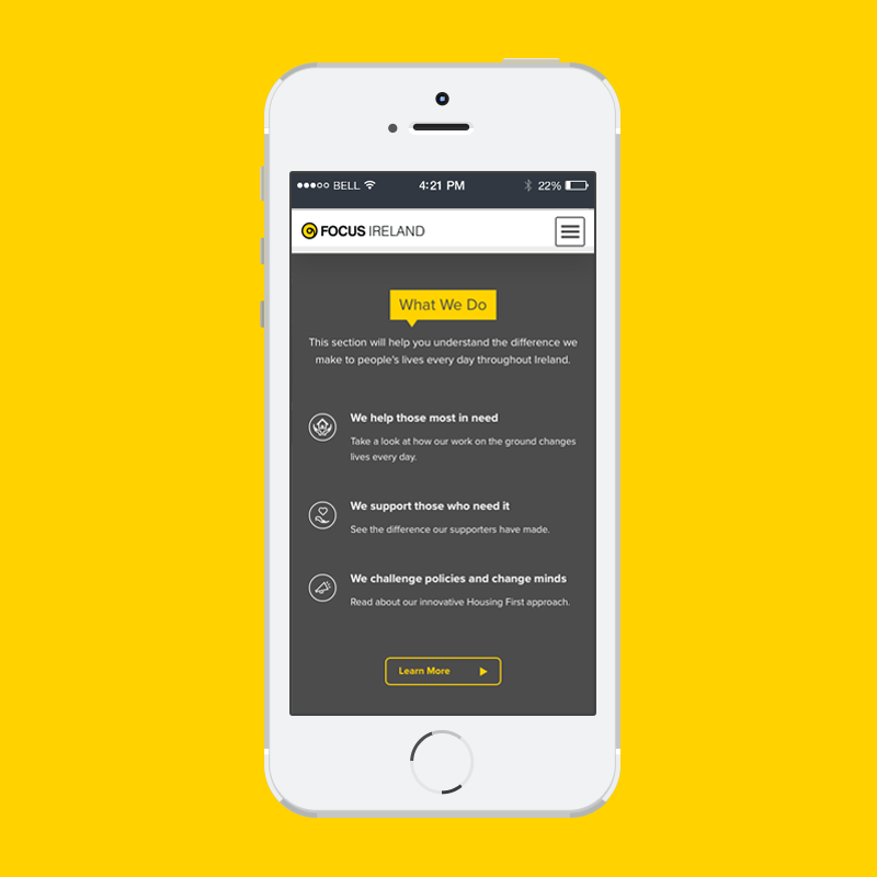
We created a fully responsive site. All aspects of the site can be fully maintained by the digital marketing team.


